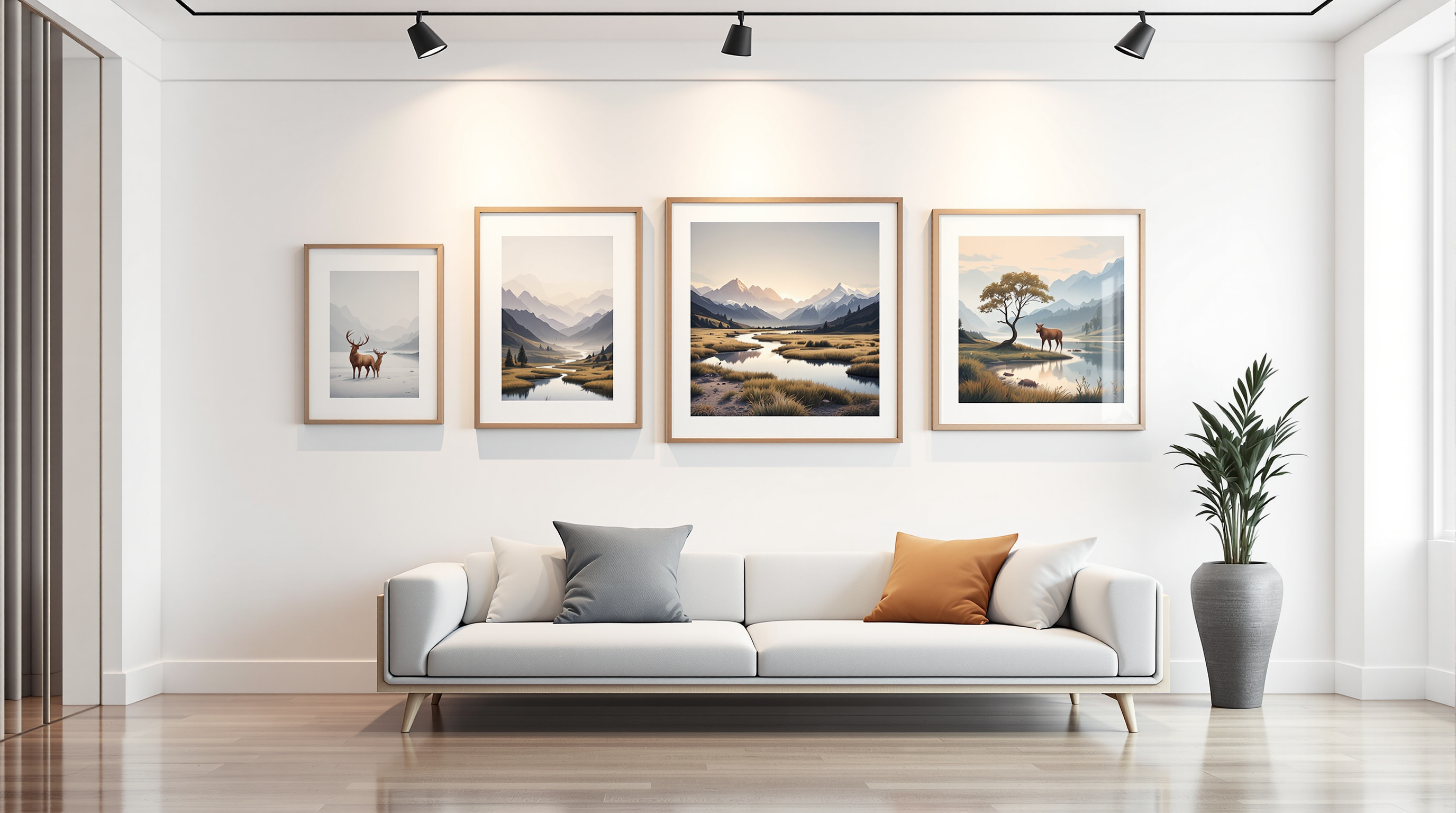
"Giclée" appears on a great many labels and means considerably less than most people assume. It is not a protected term, it certifies nothing, and it describes a printing method rather than a standard of quality. Knowing what it does and does not signify is the difference between reading a label and being reassured by one.
The term was coined in 1991 by the printmaker Jack Duganne, working at Nash Editions — a studio founded that year by Graham Nash and Mac Holbert around a heavily modified Iris continuous-flow inkjet proofing printer. Duganne wanted a word for fine-art inkjet output that did not sound like office equipment, and took it from the French verb gicler, to squirt or spray; the noun giclée is roughly "that which is sprayed." It is, in other words, a marketing coinage — an entirely respectable one, but not a technical designation.
Giclée describes how a print was made, not how well. A poor scan printed with dye inks on unbuffered paper is still, technically, a giclée.
Three variables do nearly all the work, and none of them is the word on the label.
A claim of "100 years" or more is a projection from accelerated testing under stated display conditions, not a guarantee. The conditions matter as much as the materials.
Printed numbering follows conventions that are widely used and not legally enforced. A fraction such as 24/150 means the twenty-fourth impression of an edition limited to one hundred and fifty. Beyond the numbered edition, several designations recur: A/P (artist's proof, historically the artist's own copies, conventionally a small percentage of the edition size), P/P (printer's proof), and H/C (hors commerce, not for sale — usually samples). An "open edition" is unlimited, which is a perfectly honest thing for a print to be, provided it says so.
Two things are worth checking on any print described as limited: whether the limit covers all sizes or only one, and whether it covers all substrates. An edition of 150 that is 150 on paper and 150 on canvas is a different proposition from one that is 150 in total.
Reproduction changes some genres more than others. Work whose effect depends on surface — heavy impasto, visible drag of a bristle brush, the physical relief of the paint — loses most of what makes it work when flattened, and a canvas-substrate print does not recover it. Work whose effect is chromatic and tonal survives reproduction far better, which is one reason sporting and wildlife subjects have such a long print tradition: they were disseminated by popular printmaking from the start, and were composed with that in mind.
Light is the main agent of damage, and it is cumulative and irreversible. Museums typically display works on paper at low illuminance — on the order of 50 lux — and rotate them out of light entirely for long periods. Domestic display cannot match that, but the same principles apply in weaker form: keep prints out of direct sun, use UV-filtering glazing, and accept that a print in a bright south-facing room has a shorter life than one in a hallway.
Framing does the rest. The print should not touch the glazing — a mat or spacer provides the gap — and every material in contact with it should be acid-free: rag mat, acid-free backing board, and inert hinges rather than pressure-sensitive tape. Stable humidity matters more than any particular level; repeated cycling is what causes cockling and, over time, mould. The Library of Congress collections care programme publishes detailed and freely available guidance on all of this, and it is the best starting point for anyone framing work they intend to keep.
The Library of Congress guidance for works on paper recommends a cool, clean, stable environment with about 35% relative humidity and minimal light. It also advises isolating acidic papers so their acids do not migrate into neighbouring works. Acid- and lignin-free folders, mats and boxes provide supportive enclosures; a mixed stack of prints, drawings and ordinary paper should therefore be considered sheet by sheet.
For any necessary inscription, use pencil rather than ink and place the sheet on a clean, hard surface. This helps avoid embossing the mark through to the other side. Rubber bands, self-adhesive tape and glue do not belong on the paper. Clear polyester sleeves need a separate decision: they contain no alkaline buffer, and their electrostatic charge can lift powdery media, including pastel and charcoal. A sleeve suitable for viewing one print is therefore a poor default for storing the loose drawing studies beside it. Choose the enclosure for the actual surface, rather than treating every work on paper alike.
Never direct sun. UV-filtering glazing. A gap between print and glass. Acid-free mat, board and hinges. Stable humidity beats any particular humidity — it is the cycling that does the damage.