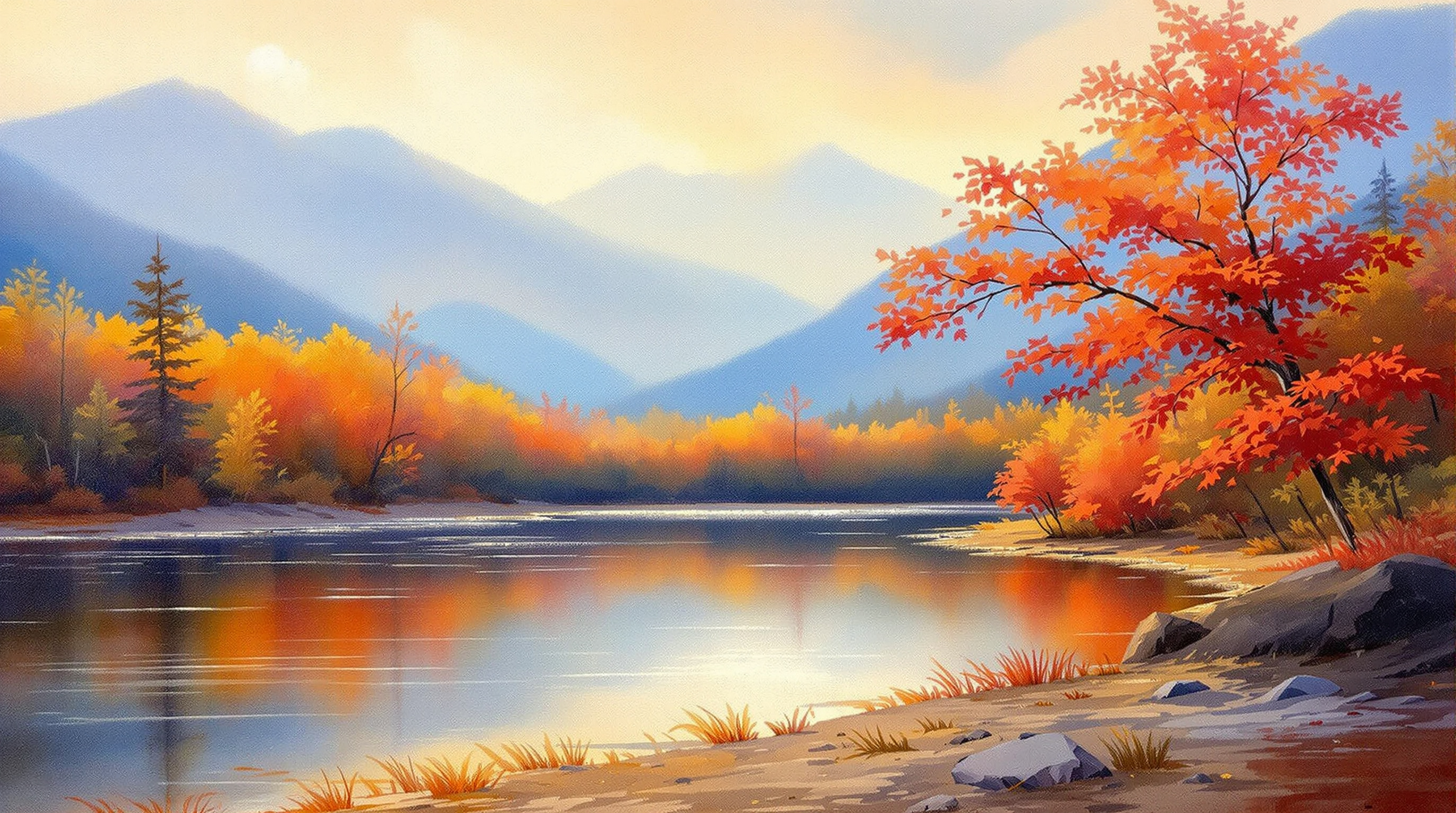
The Southern Appalachian landscape presents painters with an unusually legible version of a problem every landscape painter has: how to make a flat surface read as deep space. Here the atmosphere does much of the work in advance. Ridge stacks behind ridge, each successively paler, cooler and lower in contrast, and the eye reads the sequence as distance before it has consciously identified a single object. Understanding why that happens is the difference between copying the effect and being able to construct it.
The haze is not simply water vapour. The forest canopy emits isoprene, a volatile organic compound, in large quantities during the growing season. Isoprene reacts in the atmosphere to form fine aerosol particles, and those particles scatter short-wavelength light preferentially. The result is that everything seen through a sufficient depth of air acquires a blue cast, loses contrast, and shifts towards the value of the sky.
For a painter this converts into three linked rules, usually taught together as aerial or atmospheric perspective. With increasing distance: value contrast compresses (darks lighten far more than lights darken), hue shifts cool towards blue-violet, and chroma falls — colours grey out. The most common beginner error in this landscape is painting a distant ridge at the same saturation as a near one, which collapses the picture into a flat pattern regardless of how accurate the drawing is.
Distance is a value relationship before it is a colour relationship. If the far ridge is too dark, no amount of blue will push it back.
The region's autumn colour is not one phenomenon but two, and painters who understand the difference place their colours more convincingly. The yellows and oranges — tulip poplar, hickory, birch, beech — come from carotenoid pigments that are present in the leaf all season and are simply revealed as chlorophyll degrades. The reds and purples — red maple, sourwood, dogwood, black gum, sumac — come from anthocyanins, which the leaf actively synthesises in autumn, and whose intensity depends on the weather: bright cool days and cold-but-not-freezing nights produce the strongest reds.
Because reds are made and yellows are merely uncovered, the two run on different schedules, and elevation stretches that difference further. Colour moves down the mountain over several weeks, so a single view from the Blue Ridge Parkway in mid-October can contain bare high ridges, peak colour at middle elevation, and still-green valley floor in one frame. That vertical banding is a compositional gift and a colour-control problem in equal measure.
Painting from direct observation — plein air, in the term borrowed from French — became practical for most painters only after the collapsible metal paint tube was patented in 1841; before that, transporting usable oil colour was a serious obstacle. In steep country it remains logistically awkward. The usable window is short, because on an east- or west-facing slope the light changes fast and shadows swing through large angles within an hour. The standard discipline is to fix the light effect early — block in the large value masses in the first twenty minutes and refuse to update them as the sun moves.
Weather compounds it. Mountain fog forms and clears within minutes; a view that was fully articulated can be reduced to two values and back again. Many painters here treat that as the subject rather than the obstacle, which is why so much regional landscape work is concerned with partial visibility.
Hurricane Helene changed both the view and the route to it. The National Park Service's recovery account records 12,287 acres of forest canopy impacted and 58 catastrophic landslides, with damage in Virginia and North Carolina, mostly in North Carolina. The entire 469-mile Parkway initially closed. By fall 2025, more than 400 miles had been returned to public use, along with 140 miles of trails and eight impacted vistas.
Those figures give a painter context, rather than a ready-made composition. Where canopy loss is visible, the useful question is how the opening changes the balance of sky, ridge and near ground. Compare the shapes actually present with any earlier reference; a familiar viewpoint should not become a reason to paint trees that are no longer there. A rehabilitated vista and a regrown forest describe different things, so neither should stand for the other in a picture's explanation.
The account of the Blue Ridge landscape and its craft schools after Helene follows these changes alongside Penland's return to residential work.
Oil dominates for studio landscape work because glazing suits atmospheric depth: a thin cool glaze over a dried underpainting pushes a ridge back in a way that is difficult to achieve by mixing alone. Watercolour is the classic outdoor medium — light to carry, fast, and naturally suited to soft-edged atmospheric transitions, since a wet edge is a lost edge. Granulating pigments such as ultramarine and viridian settle into paper texture in a way that reads convincingly as distant forest. Acrylic is the pragmatic field choice in warm months, though its fast drying is a liability on a hot ridge.
Southern Appalachian landscape painting sits inside a larger American lineage in which the mountain view carried explicit meaning — the nineteenth-century emphasis on scale, weather and light as moral subject. The Smithsonian American Art Museum and the North Carolina Museum of Art both hold collections that let the regional work be read against that background, and the Getty publishes technical material on the materials and methods behind it.